Beauty Without Fuss

Popular Posts

Recent Posts

Thursday 15 August 2013

Sleek MakeUP Vintage Romance Palette & Antique Blush


Well, I said I needed to try some cheaper makeup ... and here I am!  Again, like Illamasqua, Sleek MakeUP isn't a brand I feature often, as a lot of the collections don't "speak" to me.  This one, however, very much did.  I don't get the packaging much, it says "Autumn" rather than "Romance" to me, but the contents are delightful:


 The eyeshadow shades are named after honeymoon destinations, l-r on the top row we have

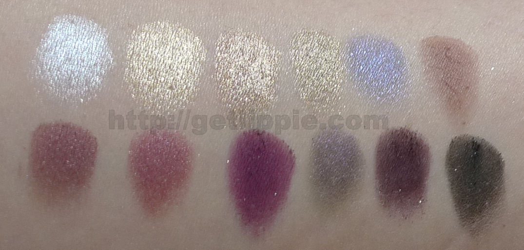
Pretty in Paris - silver (metallic)
Meet in Madrid - gold (metallic)
Court in Cannes - taupe (shimmer)
Lust in LA - olive (shimmer)
Romance in Rome - blackened navy (shimmer)
Propose in Prague - terracotta (matte)

And on the bottom row (l-r) we have

A Vow in Venice - maroon (shimmer)
Marry in Monte Carlo - fucshia (metallic)
Honeymoon in Hollywood - purple (shimmer)
Bliss in Barcelona - blackened purple (shimmer)
Forever in Florence - matte purple (glitter)
Love in London - matte black (glitter)


I found the shadows to be deeply pigmented, even without primer, but the pans are a little prone to kicking up dust, and they're slightly "glazed" after just a couple of uses, but for the price (£7.99) these are extremely minor quibbles.


I found the two darkest non-glitter shades were the hardest to swatch, both Romance in Rome (blackened navy, and Bliss in Barcelona (blackened purple) have a slight duochrome effect, but neither are as pigmented as any of the other shades, which is a shame, but this still leave ten really rich, pigmented and pretty colours to play with.

I created this look with the palette:


 I used Court in Cannes all over the mobile lid up to the crease, and Lust in LA to line the lower rim.  Then I defined the crease and outer corner with A Vow in Venice, and then patted a little Marry in Monte Carlo onto the lid to brighten.  Then I liked the upper lid with Love in London.  The look lasted all day over primer, and I was really pleased with it.


Antique is a bronzed-rose with a large amount of silvery-blue shimmer in the formula.  It's pretty, but a little too glittery for me for everyday wear.  Be a great shade for evening wear though.  I'm an idiot and forgot to swatch this separately.  For £4.99 though, this is a great bargain, it's very reminiscent of Sin by NARS.  I'll try and swatch them side-by-side next week.


The Sleek MakeUP Vintage Romance palette and Antique blush will be available from September.  You'll be able to find it at Superdrug.


The Fine Print: PR Samples.

This post: Sleek MakeUP Vintage Romance Palette & Antique Blush originated at: Get Lippie All rights reserved. If you are not reading this post at Get Lippie, then this content has been stolen by a scraper
Share:

Wednesday 14 August 2013

Illamasqua Shard vs Lancome Rose Sulfureuse

 
The sharp-eyed amongst you will have noticed that I've featured two very similar lipstick shades this week, Illamasqua Shard and Lancome's Rose Sulfureuse, both shades of plum, they're both deep and pigmented and cool, I like them both very much.  Typical though, you go and buy a lovely plum lipstick, then attend the launch of yet another beautiful plum lipstick literally minutes later - lipsticks are like buses, sometimes ...

Anyhoo, I thought it might be good to compare the two:


Illamasqua Shard is 4.2g for £16.50, and Lancome Rose Sulfureuse is 4.0g for £21.50.  


In the bullet, Shard appears bluer, and deeper, whereas Rose Sulfureuse appears pinker, both look matte in the bullet, which is surprising.


On swatching, the differences are more pronounced.  Shard is definitely far deeper and cooler, whilst Rose Sulfureuse is pinker, sheerer and far, far, far more glossy.


I applied a sheerer layer of Shard to my lips, than I did Rose, and the differences aren't quite as marked as a result, Shard is redder (but still cool) and rose is cooler, and still pinker.  Shard will last a LOT longer than Rose, however, but Rose will be far kinder to your lips ...

Fancy one?

The Fine Print: Mixture of PR samples and purchases.

This post: Illamasqua Shard vs Lancome Rose Sulfureuse originated at: Get Lippie All rights reserved. If you are not reading this post at Get Lippie, then this content has been stolen by a scraper
Share:

Tuesday 13 August 2013

Illamasqua Reflection Palette and Shard Lipstick


I don't often post about Illamasqua, whilst I love them and a couple of their products are in my daily staples (liquid liner in Abyss, I'm talking about you), sometimes I find them just a little too edgy, not to mention precise for me.  That said, I love the fact that they take risks, and that they feature shades difficult to find elsewhere.  The Sacred Hour collection, however, is designed for the risk-averse, which is far more down my alley.


My picks from the collection (which also encompasses a set of eyelashes, two blushes, two nail polishes, and a new variant of the Skin Base foundation designed purely for the undereye, plus a set of gems) are the Reflection palette and the lipstick in Shard.
 

Reflection is a selection of almost neutral shades, and Shard is a beautiful plum matte lipstain.  Let's take a closer look:

Natural Light

 
With Flash

The eyeshadows have an innovative powder to cream formulation, almost a gel, which makes them bouncy in the pan, and almost entirely gets rid of fallout, which, particularly with the darker shades is a blessing!


Clockwise from top left, the shades are: Precipice (icy pale yellow), Acute (silvered plum-mauve), Graphica (sparkling charcoal), and Dart (medium bronze).  The shadows are perfect for being applied with your fingers - I found that applying them with a natural-hair brush washed the shades out a bit.  Here they are, applied with a brush without primer:


The yellow doesn't show up so well on my skin as my skin is slightly yellow, but I love the mix of colours, and think it'd be easy to get a range of looks from this quad.  My favourites in particular are Acute (surprise!) and Graphica.  I find the shadows to be long-lasting even without a primer.


Here you can see them with the lipstick, which I adore. A long-lasting stain, this is a perfect cool purple (or, as illamasqua describe it, a red-violet).   It can be applied fully as a completely opaque lipcolour, or sheered out as a stain, as below:


Applied fully, you can get a proper "goth" look going on, which I rather like, but your mileage may vary.  I don't find it quite as drying as Illamasqua's other matte lipsticks (ironically), and the stain has excellent lasting properties.

What do you think of my picks of the Sacred Hour collection?

The Fine Print: PR Samples.

This post: Illamasqua Reflection Palette and Shard Lipstick originated at: Get Lippie All rights reserved. If you are not reading this post at Get Lippie, then this content has been stolen by a scraper
Share:

Monday 12 August 2013

Lancome Rouge in Love - 379N Rose Sulfureuse

  
I've been sorting through my lipstick collection a bit recently, trying to find the best colours to "match" my new palette, and I realised that I didn't have any really deep but still cool purple shades.  I have SO many burgundy and wine shades, in a variety of textures, but I wanted to explore some cooler shades.  I'm short on plums for some reason, and, well, we are heading into autumn.  Shush, autumn is by far my favourite time of year.


On my way through Debenhams, I did a quick smash and grab at the Lancome counter, and this colour caught my eye.  I've only tried a lipgloss from the range previously, and, whilst I liked the packaging, I wasn't particularly wowed by the formula (or the colour), so haven't really written about the "Rouge in Love" range before.


The packaging is on the dinky side, being slightly smaller than the average  lipstick casing, but there is still a full-size bullet in there which is nice (particularly as this has a £21 price tag).  Billed as a hydrating formula with a six hour wear time, it's a very traditional kind of lipstick, completely in keeping with the slightly retro-feeling case.


It looks rather matte in the bullet, but this is misleading. It's actually a lovely, glossy shade of plum. not quite as dark as it appears here:


I don't think it does last quite as long as six hours on the lips because of the glossy formulation. Certainly, if you eat or drink something you'll have to top-up quicksmart, but it's an average-lasting shade, and it very definitely delivers on the hydration feeling both cushion-y and rather balm-y, and it has excellent pigmentation.  It doesn't, however, stain the lips at all.  Once the gloss is gone, the lipstick's gone completely, I found.


It's a glorious deep, cool raspberry shade on the lips.   Not quite as "milky" as my camera is making it appear here (it's definitely closer to the hand swatch colour, for some reason), it's definitely a statement shade, without being too "vampy".  The formulation is easy to wear - the press bumpf mentions "feather-lightness", and for once, I'm inclined to agree.  It doesn't last quite as long as you'd expect from the box, and the advertising materials, but reapplying is a pleasure.

Overall, I definitely prefer the Rouge in Love over the Gloss in Love formula (though I adore the unusual "click it" opening for Gloss in Love), and I'm delighted with this shade.  After a couple of weeks of £30+ lipsticks on the blog, £21 is beginning to seem positively mid-range ... I need to investigate some mega-cheap makeup soon, I think!

The Fine Print: Purchase.
 
This post: Lancome Rouge in Love - 379N Rose Sulfureuse originated at: Get Lippie All rights reserved. If you are not reading this post at Get Lippie, then this content has been stolen by a scraper
Share:

Sunday 11 August 2013

Guerlain, I have a problem ...

A BIG problem ...


I have too many Rouge G's.  Dammit!  Why can't I resist the flipping things?


Top Row (l-r) 
Galante
Madame Batifole
Betsy
Madame Reve
Georgia
Luxere

Bottom Row (l-r)
Madame Flirte
Gardner
Rouge Sensuel
Geisha
Provocative
Paresse.

Worst bit - took all the photos for this post then realised I had left Gracy and Garance in my handbag. :sigh:  
 
The Fine Print: Mainly purchases, with two PR samples.
 
This post: Guerlain, I have a problem ... originated at: Get Lippie All rights reserved. If you are not reading this post at Get Lippie, then this content has been stolen by a scraper
Share:

Thursday 8 August 2013

Guerlain Christmas 2013 - Crazy Paris Eye Palette

  
This is my final post about the Guerlain "Crazy Paris" Christmas 2013 collection, On Monday I featured the Sulfurous nail polish and UV topcoat, on Tuesday there was the Provocative Rouge G, yesterday I featured the Crazy Pearls Les Meteorites, and today I'm showing you the Crazy Paris eyeshadow palette, which is on the far right of the picture above.

Guerlain haven't done a stand-alone eye palette in the Christmas collection for about four years now, I think it was a Russian theme last time (I still have it somewhere, must dig it out now I come to think of it), but this is a little different.  In the same sleek black-lacquered case we've seen in the rest of the collection, but this time the neon pink adornment is on the inside, not the outside:


There are four eyeshadow shades, a copper, a pale gold champagne, a shimmering white, and a cool sparkling pink.  Next to that, there are two shadow liners, one a mid-grey and the other a dark charcoal (it's definitely not quite black), the liner shades are "wet & dry" powders, meaning you can wet them down for a more pigmented look.

Here's how they swatch:


As you can see, they're not the most hugely pigmented shadows out there - the coppery shade is by far the softest and easiest to work with.  The pink is the least pigmented, but it is intended purely to add a sparkly finish to the other shadows, using the pink brush supplied in the palette, rather then being a stand-alone shade in its own right.  Guerlain suffer from patchiness when it comes to shadows, and this palette shows off the vagaries of their formulations quite well, some shades are soft and buttery, and some are rather hard and are more difficult to work with as a result.   I think the liners will work well wet, however, and a primer underneath all the shades would really give all the colours a  bit of "oomph".

It's an unusual mix of shades, I think, with the warm richness of the copper contrasting hugely with the rest of the cool shades, but I think I can make it work, I'll show you a FotD with this palette soon.

So, which are my top picks from this collection?  Well, it's the products featured below ...


 What caught your eye?

The Fine Print: PR Samples.
 
This post: Guerlain Christmas 2013 - Crazy Paris Eye Palette originated at: Get Lippie All rights reserved. If you are not reading this post at Get Lippie, then this content has been stolen by a scraper
Share:

Wednesday 7 August 2013

Guerlain Christmas 2013 - Les Meteorites "Crazy Pearls".


All this week, I'm featuring my picks of the Guerlain "Crazy Paris" Collection for Christmas 2013.  On Monday, I showed you the nail varnish in Sulfurous and the UV topcoat, and yesterday, it was the turn of the new Rouge G in Provocative

Today it's the turn of what is the cornerstone of any Guerlain Christmas collection, Les Meteorites Perles:

Thankfully back in a tin pot this year (I hate the cardboard pots of perles that occasionally get released, if you're spending £37 on a pot of face powder - and you are - then you want it to last), it's black-laquered, and it is adorned with the words "Champs Elysees" embossed in neon letters around the sides.  Whilst I love the black and pink that is the signature of this collection, I have to admit that I'm not a massive fan of this particular tin this year, I much prefer the sleeker styling of the Meteorites Perles de Nuit from Christmas 2011.  This is ... whilst I hesitate to actually say it's tacky, I'm think I'm going to have to say that it's a  ... bit tacky.  So there.


Right, having got that off my chest, let's take a look at the perles, eh?


New to the mix this year is a "tangy" pink, cool toned, it mixes with the gold, white, lavender and beige of the rest of the perles quite well:


It's quite a bright pot this year!  They're still delightfully scented with violets, and give the same "airbrush" finish that you get with the normal perles.  They're not coloured enough to act as a blusher, and don't appear pink on the skin.


I tried my best to swatch the perles, but this is a hiding to nothing, as you can see below:


I always have a pot of Les Meteorites on the go, they're easy to dip into, I adore the smell, and love the airbrushed, non-cakey effect. But, whilst it might be a collectors item, I'm not a huge fan of the tin.  Still, you don't wear the tin, eh?

What do you think of the packaging this year?


This post: Guerlain Christmas 2013 - Les Meteorites "Crazy Pearls". originated at: Get Lippie All rights reserved. If you are not reading this post at Get Lippie, then this content has been stolen by a scraper
Share:
© Get Lippie | All rights reserved.
Blogger Template by pipdig