Monday 20 February 2012
Nail of the Day - A-England Avalon
It's terribly hard work having a nail blogger as one of your best friends, you know. I'd been seeing swatches all over the place for the recent A-England legend collection and thought they were very pretty, but it wasn't until I saw Helen's A-England post last week that I did what every good beauty blogger eventually does, and ripped my friend's idea off in its entirety. In fact, I ordered the polishes within an hour of her post going live, and was delighted beyond belief that I had the polishes in my sticky little fingers around 24 hours later. Astonishing service from A-England! And the postage was free, as well - amazing!
In fact, I bought five polishes (not all of them from the Legend collection):
I have Princess Tears, Avalon, Ascalon, Lady of the Lake, and St George. They are all very, very beautiful:
I'll bring you swatches of the rest of the shades soon:
But first I wanted to concentrate on Avalon, which is a gorgeous, glowing, deep, deep jewelled purple. Pictures of it don't really do it justice, it's almost a perfect dupe for the Cadbury purple, as you can see from the next couple of shots:
Doesn't everyone buy chocolate as props these days?
These pictures make the nail colour look a bit different from the bottle, but the shade in the bottle is much nearer to what is on the nails, my shots pull a little of the warmth from the shade, and simply don't show the smoothly metallic glow that you get from this colour when you're wearing it. The next shot, which is instagrammed to death (for which I apologise), is, ironically, the most colour accurate picture on this page:
This might just be the most beautiful nail varnish I've ever worn.
A-England polishes cost £9 each and are available from A-England's online store.
The Fine Print: Purchases. Many, many, many sincere apologies to Helen from Just Nice Things for not having an original thought in my head.
This post originated at: http://getlippie.com All rights reserved.
Sunday 19 February 2012
Lipstick of the Week - 19 February 2012
Back to its normal slot from now on (somehow it just didn't feel "right" on a Monday), and back to random choices too, this week's Lipstick of the Week features some of my all-time favourites, a lipstick that drives me NUTS, something brand new, and what is possibly the lipstick I get most comments on whenever I wear it.
Shall we get on and take a closer look?
Natural Light:
Flash:
So what made the list this week? Clockwise from top left, we have:
Chantecaille Lip Chic in Tea Rose - possibly my favourite lipstick texture ever for the winter months, this is my perfect neutral lip shade, and one I'll have to get a back up for pretty soon. Dammit.
Tarina Tarantino in Cameo - I hate this lipstick, but someone in the US (waves at Paula from Older Girl Beauty) went to a lot of trouble to get this for me, and so I doggedly continue wearing it, even though it looks like this after about six uses:
 |
| Gah! |
Chantecaille Lip Chic in Bourbon Rose - A lighter, pinker version of Tea Rose, I use this on the (increasingly rare) days when I'm trying not to look like I'm wearing makeup at all.
Tom Ford in Indian Rose -What was definitely my favourite lip shade of last year still makes it into heavy rotation this year, and I've just acquired a back up. I've just heard it's the best selling shade in the relaunched line too, so good to know I'm not alone in my love of this one!
Tom Ford in Violet Fatale - a new acquisition. Not quite a replacement for my beloved (and sadly discontinued) Pure Pink, but ... close. Kinda. Expect an in-depth review of this one once I've had a chance to wear it in properly. Not nearly as scary as it looks in the bullet, thank goodness!
Hurraw Balm in Chai Spice - If you're a long-term reader, you may remember me being devastated by the decision of Badger Balm to discontinue their Chai Rose Balm a couple of years ago. This is the nearest I've found to a replacement, it's raw, vegan, organic, and as the label has it, "good". It's a good conditioning balm, and I like wearing it a great deal. Cheap too, at less than £4 a stick. Mine came from Content in Marylebone, one of my favourite shops in London.
And finally, Smashbox Limitless Lipstain in Sangria - literally every time I wear this, people tell me how much they love it. Which is an odd thing, because I wear red lipstick a lot, but there's something about this shade, and the velvety finish on the lips that draws peoples' eyes to it. I love wearing it, and it's backup-worthy in my eyes. I'll be honest though, I mainly used to love it because it's called Sangria ...
You want swatches? I got you swatches:
Natural Light:
Flash
And yes, I have swatched the balm at the end there too.
What've you been wearing?
Anything caught your eye?
This post originated at: http://getlippie.com All rights reserved.
Friday 17 February 2012
Tom Ford Quad Comparison - Titanium Smoke and Silvered Topaz
Someone pointed out to me recently that the two Tom Ford Eyeshadow quads that I own look a little similar. Well ... it can't be denied. In fact, for a while, I was convinced that the top row of both palettes was identical, myself! So, any excuse to get them out again, I thought I'd do some side-by-side swatches of each:
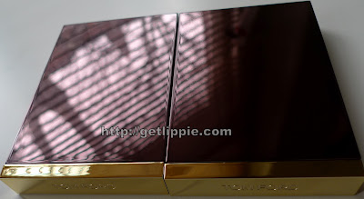
But first, a look (or two) at the palettes together:
Look dang similar, those two top rows, eh? Let's take a closer look:
So, just how similar are they? Here's the swatches:
The glitter shades are indeed slightly different, the Titanium Smoke has a more "steely" grey appearance, and the Silvered Topaz is a very pale gold. In reality though, they apply so sheerly that there's no way you'd be able to differentiate between the two of them on the eyes.
The grey shades in both are more different - Titanium Smoke is definitely greyer, and, on application, is both more pigmented and less powdery. Silvered Topaz has a sheerer, slightly browner appearance. I definitely prefer the Titanium Smoke out of these two.
For the bottom row, I simply had to swatch the matte shades together. Out of these two, Silvered Topaz is very definitely the more pigmented out of the two - I barely had to touch my skin with the brush! But, for me, the Titanium Smoke is the most versatile shade, as it makes a wonderful powder liner, and is particularly suitable for tightlining your upper lashes. The Silvered Topaz is actually so pigmented that it's difficult to blend, and, the slightly red undertone makes it unsuitable for the inner rim of the eyes.
I'll say one thing, the bottom left shade from Silvered Topaz was damn near impossible to swatch, so much so that it really annoyed me. The Titanium Smoke grey is glorious, but it is just that little bit ... too sparkly. That said, that hasn't stopped me wearing it practically every day for the last couple of weeks!
So, which one catches your eye?
The Fine Print: Purchases. I am a mental.
This post originated at: http://getlippie.com All rights reserved.
Thursday 16 February 2012
Dior Skinflash Comparison - Shades - 001 and 002
I've somehow acquired two Dior Skinflash highlighters, in shades 001 and 002, and I thought it would be interesting to see them side by side.
Both housed in the signature silver with navy livery, Skinflash is a brush-pen style highlighter of the type that is commonly sold as a "concealer" by department store sales assistants. What they actually do is spread reflective particles over the skin which bounce light off a particular area, diminishing the eyes' ability to see imperfections. That said, they're better used to draw light to areas in the same way you'd use a highlighter - on cheekbones, browbones etc - than use them to disguise dark circles and the like, because coverage can be very sheer, and the reflection effect can actually draw attention to the areas you're trying to hide, if you apply with too heavy a hand.
Recall the "reverse panda" effect?
Yeah, don't apply too much, or that's you that is.
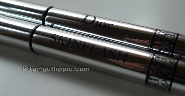
Anyway, where was I? Oh yes, there are two shades of Dior Skinflash:
 |
| L - 001 & R - 002 |
 | ||
| L 002 - R 001 I'm a doofus and reversed the image - sorry! |
Blended, the differences are less apparent in this picture, but next time I use Skinflash, I'll ensure I'm using shade 002, as I think it suits my skin better:
The Fine Print - one was a purchase, and one was in a goody bag at an event. I no longer know which was which. Which is how it should be, if you ask me.
This post originated at: http://getlippie.com All rights reserved.
Wednesday 15 February 2012
Ren Love Clean Skin (or, would you like a bit of porn with your cleanser?)
Now, I'm a fan of Ren, their Rose Otto Bath Oil is one of my desert island products. Last week they released their "first short film" (it is not an advert, allegedly) and here's the edited version:
It's safe for work, don't worry.
But, this is the longer version (it's less than two minutes long, but - and it's a BIG but - do not watch this if you're at work, I mean it, you will regret it and you'll likely get fired to boot) Youtube will ask you if you're over 18, and with very good reason:
Now, what I want to know, is any of this necessary? This is basically soft porn, and what on earth it has to do with the products, I have no idea. Yes, yes, it's beautifully shot, and the leads aren't hollywood-gorgeous, which is refreshing to see, but ... I don't see why they bothered.
Except ...
I suppose, for a brand, any publicity is good publicity - and I'm aware this blog post is just adding to that - but, I'll be honest, this has made me rethink how I feel about the brand. It's not that I'm offended by the film - I'm not - but any brand that stoops to showing porn to get publicity, well ... I'm not so sure that's a brand I want to spend my money on.
This post originated at: http://getlippie.com All rights reserved.
Tuesday 14 February 2012
Clarins Instant Light Blush Vitamin Pink and Coral Tonic
I spotted these in the Garden Pharmacy in Covent Garden a few weeks ago, and I was instantly smitten. I'm on a bit of a blush kick at the moment, and these are pretty different offering from a brand like Clarins, so I couldn't wait to give them a try.
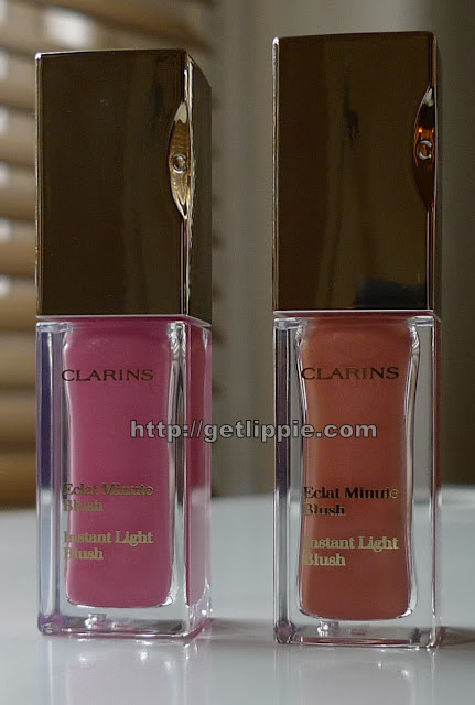
Packaged in cute nail-varnish like bottles, and brought out as part of the new spring collection, there are two shades:
When you remove the lid, there's a big sponge applicator, which is MUCH better than a brush for giving you an even application, it diffuses the gold-shot shades over the skin quite well.
It's a similar size to your fingertip, so is easy to use, and it spreads the product quite well over the skin. I still like to finish off with my actual fingertips though, I'm a fussy mare.
Swatches:
As you can see, there's a tiny amount of shimmer when the product is unblended, but this is there for depth of shade, and stops it looking "flat" on the skin rather than to add sparkle. Once blended the shades have a translucent quality, and add a delightful flush to the skin:
A little bit of this goes a long way, and I can see I'm totally going to be obsessed with the coral shade come summer when I'm a little darker, but these are genuinely gorgeous, and because I'm a lazy so-and-so, I like the fact that I don't need a highlighter too.
The Fine Print: PR Samples. But they're ones I would have bought anyway. Obsessed I am. OBSESSED.
This post originated at: http://getlippie.com All rights reserved.
Monday 13 February 2012
Lipstick of the week
With the wind and the snow this week, I felt the need for balm, but I wasn't quite content to go the colourless route, so I dug out my collection of Lanolips.
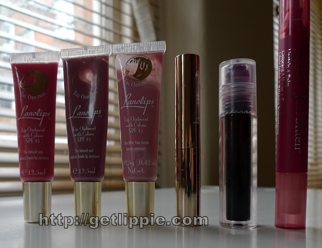
From left to right we have:
Lanolips Rhubarb
Lanolips Dark Honey
Lanolips Rose I love the lanolips formula, and I wear these often, even when I don't really need balm. My favourite, in particular, is the Dark Honey as you can probably tell from the picture above ... I understand Lanolips are bringing out a collection of body products soon, and I'm looking forward to trying them.
Topshop Gloss Stick in Glisten This is a very pretty, longlasting, gloss. It's more of a sheer lipstick than a gloss, owing to the high level of pigment.
Revlon Just Bitten Lipstain in Plum Wicked I daren't even tell you how old this bottle is, but it was a limited edition from a Halloween collection did a few years ago. And, by years, I probably mean about a decade or so. It's still good though - I bought back ups of this by the score! It's a rollerball, and it's very handy for layering, as you'll see.
Revlon Just Bitten Lipstain and Balm in Frenzy This is the newest version of Just Bitten Lipstain, which has a felt tip pen at one end, and a silicone-based balm at the other to add gloss. It's a good product, but I doubt I'll still have this one in a few years, the pen will have dried out ...
Swatches:
Swatched in the same order, but at the end I've layered Wicked Plum over Frenzy, to deepen the red - Frenzy can look a little fuschsia on my lips if I'm not careful, and I wanted a deep, deep, longlasting red on Saturday to last me through my panel appearance at TOWIB - it did the trick!
What've you been wearing? Here's a little teaser of just some of the stuff that's coming up later this week ...
This post originated at: http://getlippie.com All rights reserved.
Subscribe to:
Posts (Atom)
©
Get Lippie | All rights reserved.


