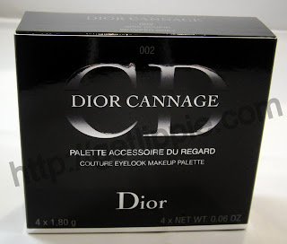
Saw this palette a couple of weeks ago at a preview and fell in love with it, but it's taken till now for me to get set up to do swatches! For Spring/Summer 2011, Dior have gone for cool greys and pinks, which makes a refreshing change from all the bronzes and corals we had last year. I have a selection of the products from this range, and I'll work my way through showing you them this week.
I selected the Whisper Grey palette because there was a little more pink in the shades than there appeared to be in 001, which is a lot more monochrome. Also, it's a darn cute little thing:
It's quilted in the same fashion as Dior handbags and feels great in the hand. There's no protective velvet pouch with this one though, so maybe not one for dragging around with you too much as the squashy pleather may get scratched. Love the Dior logo though:
Once you open the palette, you have four shadows, a decent-sized mirror, and a sponge applicator:
There's a pink, a pale grey-taupe, a darker matte grey and a frosty white (at least, that's how they appear in the pan):
It appears on first glance that the top two shades are shimmery, and the bottom are more matte, but these shades are slightly more complex than they appear, as you'll see from the swatches:
 | ||
| (swatched dry over bare skin with the sponge applicator included with the palette) |
The shimmery pink top left is not quite as frosty as it appear here, and the grey-taupe (top right) is a lot more complex, and is probably (surprise!) my favourite shade in the palette. However, the matte grey bottom left is probably going to get a lot of use from me, as it has a pinkish base, which I think will make it far more flatteringly wearable than a more traditional steel-y grey, which tends towards a blue base. I was suprised by the white, expecting it to be flat - and chalky - but there's actually a hint of shimmer, and it's shot through with a very pale, flattering gold. Used sheerly, I'm sure it'll be far more useful than a plain flat white.
I did also swatch these shades over primer, but they don't, in all honesty, look all that different:
It pulls the grey-taupe a little more silver (which I'm not entirely sure is a good thing), and make the pink a bit more frosty, but I think I prefer the swatches without a base, in all honesty.
Grey lipgloss coming up tomorrow!
The Fine Print: These products were bought'n'paid for. Ask MrLippie, he was most


I'm really into these shades. A grey lip gloss you say? I'm all eyes.
ReplyDeleteI am trying to break the habit of a lifetime (well it is advised to keep one young!) and get into eyeshadows. I like the colour combos of these, and the swatches have a hint of the sparkle which could lift my awnings. I too am intrigued by the grey lipgloss which is more in my comfort zone! I am on tenterhooks! Thanks for this. Jan x
ReplyDeleteThis is lovely. I wish I had looked at this rather than the Gris-Gris quint which I swatched and left. I think these are much more flattering and wearable shades.
ReplyDeleteMBx