Beauty Without Fuss

Popular Posts

Recent Posts

Wednesday, 10 July 2013

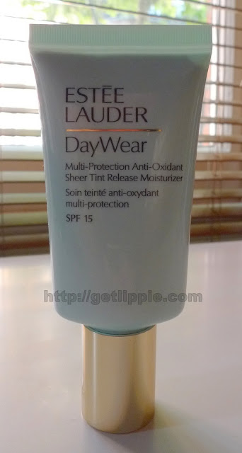
Estee Lauder DayWear Multi-Protection Anti-Oxidant Sheer Tint Release Moisturiser


Another day, another punchy-titled product from Estee Lauder ... the DayWear Multi-Protection Anti-Oxidant Sheer Tint Release Moisturiser to be precise (it not concise), is  a tinted moisturiser that I've been using on and off for years, and I was delighted to hear recently that it's been reformulated and re-launched by Lauder.

It is, as it's name suggests, a sheer tinted moisturiser, with a light cucumber scent (which I happen to really love, but your mileage might, as they say, vary), and an SPF of 15, which makes it ideal for a summer where sunshine can't always be guaranteed.

What I do like about it is the colour-adjusting technology in the formula, on squeezing the product from the tube for the first time, you might be wondering where the tint actually is:


As it's decidedly greige on first squeeze, but hold on:


Nope, still a bit grey, but it's beginning to disappear, look:


As you rub the formula into your skin, the microscopic spheres containing the pigment burst, and begin to meld with your own skintone, becoming, eventually, a transparent veil of colour:


And when they say sheer, they're really not kidding.  I left Maurice the control mole there so you can see him in all his glory.  This formula won't cover up imperfections, and doesn't layer to give more coverage, unlike the Chantecaille Just Skin I spoke about on Wednesday, but it will even out your skin tone rather nicely, and give you both a nice glow and a little protection from the sun without ever looking ashy, unless you have a very dark skin tone, that is.

It's a great staple, personally I'd still want to use my regular moisturiser underneath, as I don't really find it hydrating enough on my combination-dehydrated skin, but this is a classic product, and is great for foundation-phobics, as it simply enhances, without masking, the skin you already have.  This new formulation is a little less grey than it used to be, but that's about the only difference I can see to the original product.

The FIne Print:  PR Sample, but I've bought many, many tubes of this in the dim and distant past.

This post: Estee Lauder DayWear Multi-Protection Anti-Oxidant Sheer Tint Release Moisturiser originated at: Get Lippie All rights reserved. If you are not reading this post at Get Lippie, then this content has been stolen by a scraper
Share:

Tuesday, 9 July 2013

Current Favourite Blushers


I didn't see the point of blusher for the longest time, and so, for many years I didn't use it.  I've had high-colouring for many years, so the thought of adding MOAR COLORZ to my skin was a scary one, to say the least!  These days, however, I'd rather leave the house without lipstick than without my blusher!

Blush brightens the face, and can add shade and contour to even the widest of faces (personally, I don't bother with all that contouring malarkey because, as has been extensively reported on this blog, I am a cack-handed muppet), but blusher does make such a difference, making my skin look alive, and helping me avoid looking like a trainee goth who forgot to attend the lesson on  not dressing like an accountant.  


After my recent colour analysis, I've found blush difficult, as the shades which are nearest matches to my fan do NOT look good on my skin - NARS Sin is consistently recommended as a good blush for someone with my colouring, but ... well, it's too dark and far, far, far too brown for me, so I challenged myself to find some more suitable blush shades. 

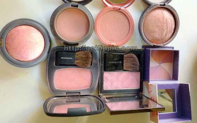
Initially, I didn't think I had any, aside from one, but after digging deep into the recesses of my blusher drawer, I managed to scramble up seven or so ... (may you never know the horrors of saying "But I don't have any like that" only to discover you're lying to yourself about it ... anyhoo, here's my pick of my blusher collection:


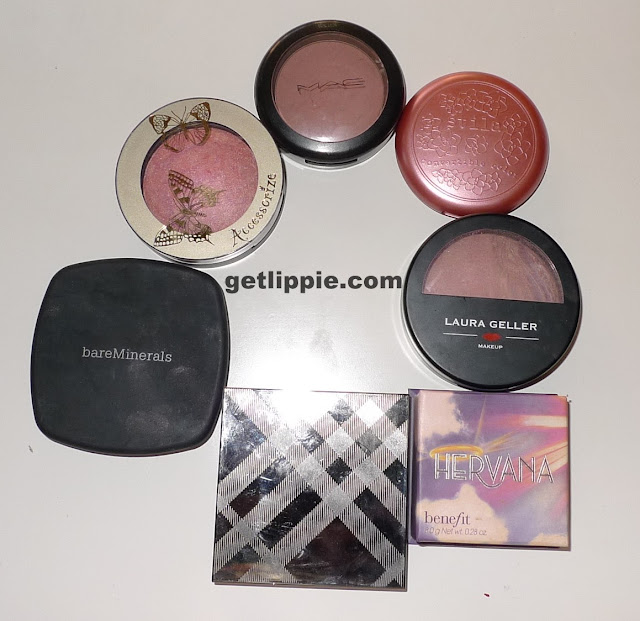
Clockwise from top left we have:

Accessorize: Merged Baked Blush in Sensation
MAC: Blushbaby
Stila: Convertible Colour in Lillium
Laura Geller: Ethereal Rose/Sateen Subtle Berry
Benefit: Hervana
Burberry: Cameo
Bare Minerals: Ready Blush in The One 

In the past couple of years, I've been pretty much inseparable from NewCID iGlow in Coral Crush, but I've been trying to use pinker shades recently, and, even though a couple of these have a touch of coral to them (in particular The One by Bare Minerals - bottom left in pic above), I think the pinker look is just a bit more "healthy" to my newly-educated eye.


Accessorize is very pink, and works well as a highlighter, also, it was very cheap!
MAC Blushbaby is an old, old favourite, but it's a little on the brown side, so needs applying with a light hand.
Stila Lillium is a great neutral shade of blush, and one I wear over tinted moisturiser.  You can wear it on your lips too, but that's really not a good look for me.
The Laura Geller has been my day to day staple blush recently.  A slightly berry pink, it has a gentle sheen, and is very pretty without making me look too flushed.
Benefit Hervana is a very pretty cool-toned matte pink.  It's a little on the sheer side, but it's a good shade for just the lightest possible flush of  colour.
Burberry Cameo is another subtle berry shade, which is on the matte side, it's a lot more pigmented than the Laura Geller, so again, needs a lighter hand (or a duo-fibre brush).
Bare Minerals is a heavily-pinked coral, and is a good easy to wear shade, even if it is a little bit warmer than the other shades in this selection.  I LOVE the Bare Minerals "pressed" powder formulations, and need to pick a few more up.

So, what are your go-to blushers at the moment?

The Fine Print: Mainly purchases, ironically.

This post: Current Favourite Blushers  originated at: Get Lippie All rights reserved. If you are not reading this post at Get Lippie, then this content has been stolen by a scraper
Share:

Monday, 8 July 2013

Empties!


I don't finish many products in all honesty, and of those that I do finish, I don't often repurchase.  These three products have been through the wringer and then some, and I have backups (multiples in some cases!) of all of them.

Hydraluron

I'll be honest, when I was first using this, I wasn't much impressed.  I'd seen raves - LOTS of raves - about this product in a lot of places, but I couldn't see what, if anything it was doing for my skin, so I stopped using it.  BIG mistake.  Dehydration lines soon started forming, and my skin was taking longer to "plump" up in the mornings.  Now I'm a total convert, and use this on a daily basis, my skin is far more resilient, and feels dewier and fresher than it's been for a long time as a result.  For me, the true sign of a great product is that you see a major difference when you stop using it, and Hydraluron passes that test, in spades. 

Clarins Gentle Exfoliator

I LOVE this stuff.  It's gentle enough to use every day (even though the packaging suggests you use it 2-3 times a week), and it constantly reveals fresh new skin.  I use it every other day, and found the bottle lasted the best part of five months.  Somewhat more than a toner, but less harsh than a full-on chemical peel, it's perfect for sensitive skins who need a bit of brightening.  Wouldn't be without it now - and have purchased a cupboard full of it, just in case!

Chantecaille Just Skin Anti Smog Tinted Moisturiser

This makes my skin glow, to the extent that complete strangers have commented on my "beautiful skin" (which I find hilarious, tbh), it's a bit  more pigmented than your average tinted moisturiser, and it layers wonderfully, meaning that even blotchy-faces and high-colouring can be covered, which is great.  This is also great skincare, and I have been known to use this as my only moisturising product, in an emergency, with no ill-effects.  Yes, it's pricey (£58 worth of pricey to be exact), but my last tube lasted well over a year, as a little bit goes a very long way.  When I need bit more coverage, I simply powder over it with something like MAC's Studio Fix, but mostly I just leave the glowing, healthy finish unadorned on my skin

The Fine Print: A mixture of PR samples, purchases, and re-purchases.  Oh, and re-re-purchases.  

This post: Empties! originated at: Get Lippie All rights reserved. If you are not reading this post at Get Lippie, then this content has been stolen by a scraper
Share:

Sunday, 7 July 2013

Boo!

I've not been around much the last couple of weeks, a combination of being away and some bad news over the last fortnight have conspired to make the blog take a back seat recently.  But, rest assured, I've not been resting on my laurels!

Here's a sneaky peek at something I'm currently working on ...


Normal service to be resumed tomorrow ... 

This post: Boo! originated at: Get Lippie All rights reserved. If you are not reading this post at Get Lippie, then this content has been stolen by a scraper
Share:

Wednesday, 19 June 2013

Lipstick Queen Launches Velvet Rope Collection

I love a good lipstick launch, me.  And, when the lipstick launched is a good lipstick, then so much the better, frankly.

I'm a fan of the Lipstick Queen range (some long term readers might have noticed), and, barring the occasional WTF moment (Jean Queen, invented to tone with your denim, I'm looking at you), the standard of launches is usually extremely high, so I was gratified to notice that the Velvet Rope collection looks like taking Lipstick Queen from the realms of the luxe, to the super-luxury category.

Natural Light
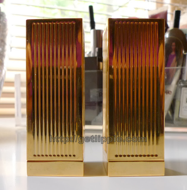
 The gorgeously hefty packaging, which is heavier than Tom Ford, yet less bulky than Guerlain Rouge G, is beautifully deco, and has lovely magnetic fixings giving an extremely satisfying "clunk" on opening and closing.  Left we have Entourage, and right we have Brat Pack (a name that made me laugh quite hard when I noticed it - I guess you had to be around in the eighties to get it though).

With flash
Formula-wise, they're unusual for a Poppy King lipstick, having a faint peppermint smell, but it's not overwhelming, and fades very quickly.  I was a little disappointed there wasn't a rose, or violet scent, to further echo the retro-packaging, but I got over myself very quickly.

The lipsticks are feather-light, literally one the lightest-textured lipsticks I've ever come aross.  They pack a wallop of pigment too:


This is one pass per lipstick, Entourage on the left and Brat Pack on the right.  Entourage is a dark berry shade, with a hint of brown, and Brat Pack is a beautiful, bright, rather neutral red.

You can barely feel you're wearing anything, and I haven't noticed any problems with drying lips out in use.  Lasting time is rather average - and the colour will transfer, they're not designed as a long-lasting formula - but with such a beautiful package, reapplying is barely a hardship at all.

One the lips (both in natural light)


Entourage.  It's a bit goth, but I like it anyway.  The natural redness of my lips makes this more of a dark blood-red on, than it did in the swatch.


Brat Pack - a glorious, happy red. I'm a little addicted.

The sad thing about these lipsticks is that they'll only be available in five shades at the initial launch (which is in September), these two, alongside a pink (which I NEED, frankly!), a nude and a wine-red shade (which I definitely need to see).    The price point will be £32.  Which is, I think, about right.  The packaging is much, much more "luxe" than a Tom Ford lipstick, which I've always thought was a bit ... well ... cheap in comparison to the price point, and the price is comparable to a Guerlain Rouge G, which Velvet Rope gives a good run for its money in both packaging and texture.

Other ultra-luxury lipstick brands should be quaking in their boots, frankly ...

The Fine Print: PR Samples.
 
This post: Lipstick Queen Launches Velvet Rope Collection originated at: Get Lippie All rights reserved. If you are not reading this post at Get Lippie, then this content has been stolen by a scraper
Share:

Monday, 17 June 2013

My Favourite Lipstick Colours


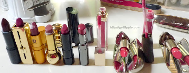
Natural light
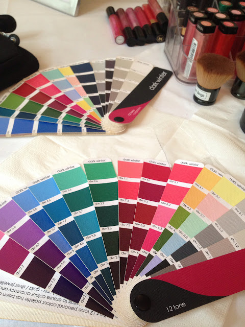
Since my Sci-Art colour consultation last week, I've been thinking about colours a bit (a lot) more, and have been wondering what changes to make both to my wardrobe, and my makeup.  Luckily, as I was drawn to the Dark Winter Palette anyway, there aren't a lot of changes that I think I need to make.  I do have a bunch of "dusty shades" that I need to dump, but as I wasn't wearing many of them anyway, but there you go.  

With Flash

(Left-Right)
Topshop Lipstick - Wicked
Guerlain Rouge Automatique - 761
Lipstick Queen Saint in Wine
Dior Diorifique in Mystic Mauve
Bare Minerals Moxie in Live Large
Chantecaille Lip Chic in Tea Rose
Clarins Gloss Prodige in 04 Candy
Guerlain Rouge G in Gracy
Becca Lipgloss in Palm Breeze
Guerlain Rouge G in Georgia

However, when it comes to lipsticks, I'm keeping my brights in my wardrobe, even though they're technically not what I should be wearing.  I like them, and I enjoy them, so even if they're not quite "right", I'm keeping them!  That said, I thought I'd pull a bunch of what are my all time favourite lipsticks (of all time), the shades I reach for time and time and time again (I'm a creature of habit, what can I say) and  compare them to the fan of colours I was given at the end of my consultation.

This is what happened:

Natural Light


With flash
They say you should compare your shades to your fan only in daylight, and I'd agree with that, flash, or lighting that's a little too cool or warm can pull your comparisons off slightly. It washes out the swatches on the fan a little here, and reflects off some of the pigments in the lipsticks.


The colours are rich, and some are deep, but none of them are too bright, which is very much the signature of a dark winter palette.  Lots of these lipsticks are very old (the Diorific has been discontinued twice to my knowledge!), but some are very new addictions to my collection.

Here's some swatches, in the same order as the top two pictures, and a list with their DW fan match numbers:

  
(Left-Right)
Topshop Lipstick - Wicked (DW7.8)
Guerlain Rouge Automatique - 761 (DW7.7)
Lipstick Queen Saint in Wine (DW6.4)
Dior Diorifique in Mystic Mauve (DW7.3)
Bare Minerals Moxie in Live Large (DW6.2)
Chantecaille Lip Chic in Tea Rose (DW6.2)
Clarins Gloss Prodige in 04 Candy (DW6.1)
Guerlain Rouge G in Gracy (DW5.1)
Becca Lipgloss in Palm Breeze (DW5.3)
Guerlain Rouge G in Georgia (DW5.4)

Whilst there are quite a lot of similarities in this shade range, they're all pretty different, and there's a lipstick for all occasions - the Guerlain Shine Automatique (second from the left) is actually the lipstick I wore to my wedding!   The Dior (fourth from the left) is probably a little too brown (not to mention too old - but it was a favourite for a very long time) for me to wear now, but all the others are colours I wear very regularly.

I'll dig out some reds for the next palette comparison ...

This post: My Favourite Lipstick Colours  originated at: Get Lippie All rights reserved. If you are not reading this post at Get Lippie, then this content has been stolen by a scraper
Share:

Thursday, 13 June 2013

Sci-Art Colour Consultation


Inspired by this post by London Makeup Girl, I booked a colour consultation on Monday with Nikki Bogardus of MyColorRX on her most recent trip to London, as a birthday treat for myself.  I've always been pretty good at putting makeup shades together, both for myself and for other people (even if I do say so myself), but when it comes to co-ordinating outfits, I'm not afraid to admit that frankly, I don't have a clue.

I don't like frills and furbelows, anything too "fussy" makes me feel like I'm in fancy dress, so I spend a lot of time in black, and grey, with the occasional foray into wine-shades or purples, when I fancy a change from the monochrome.  My wedding dress, for example: 


Anyway, I wanted to see if there were other colours out there for me, and to see if my instincts were correct.  After doing some reading around about sci-art I'd come to the conclusion that I was a Dark Winter, or possibly a Dark Autumn, but the Dark Winter conclusion was (I admit it) based on the fact that I like purple and black, and the Dark Autumn conclusion was based on the (highly scientific) evidence that my hair and eyes both contain quite warm tones:

  
The Sci-Art process strikes me as fairly scientific, most people are familiar with the old-style of colour matching, where you are either a Spring, Summer, Autumn or Winter, and you were given specific "colours" that only each season can wear. And can wear only those colours. It has been widely acknowledged that it is somewhat restrictive ...

Sci-Art acknowledges that most people aren't purely warm, or cool, and in fact contain a mixture of both (for example, there's a lot of pink in my skin, so I'm cool, but my eyes are warm, and the veins in my wrists appear green, oh, and I tan, all of which are "warm" traits), so four seasons doesn't really take into account these "neutral" traits.  Sci-Art measures hue, temperature and saturation of colours, meaning each season can be broken into three traits, so there are, in fact, 12 different "seasons". All have a  Bright and True variant, but and springs and summers have their third classification as Soft and autumns and winter have a Dark type too.  For a far more detailed explanation of how this works, please read this wonderful blog post by Zuzu's Petals on the science behind a draping. 


Essentially, this means you get a wider variety of colours to wear, but what is important is the shades of the colours you choose to wear, and your "draper" is the one who helps you to spot which shades of which colours are the ones that flatter you most.

After wrapping yourself into a grey gown, and covering your hair, you're draped with four colours, black, brown, silver and gold to determine which season you might fall into. For me, black (winter) was okay, brown (autumn) wasn't awful, silver (spring) was fine, and gold (summer) was ... not nice.  All this meant was that I wasn't, actually, one of the "true" seasons. Most people aren't, so that was fine.

After that, you're draped with a number of red shades, which determine just how warm, or cool your skintone is, from this we determined that my skin definitely has cooler traits!

After this follows a draping of different shades of very many colours, to determine which ones are "your" shades, Nikki was an excellent guide through this process, pointing out what she could see that I couldn't, and explaining why it was that some colours worked better than others.  We had one moment of hilarity when the mustard swatch went on, and Nikki exclaimed that she'd never seen anyone "reflect the colour that badly, ever!".  I had to agree, it was not good.

We found that bright colours tended to wash me out, that yellows and oranges are not flattering, and that I need a lot of contrast, and quite a bit of depth to my shades.  This, coupled with the cool skin, and warm eyes meant that a "diagnosis" of Dark Winter was rather inevitable quite early on, and the drapings only proved it.


 Now, whilst I don't love the green in this picture (and I really don't) I can see that it has neutralised the pink/red tones in my skin, and made my tones look more even.  Personally, I think if I'm going to wear green then it's going to be more of a "forest" shade, or a darker emerald, but as someone much wiser than me said earlier: "I don't think you will automatically love all the colours in your fan, and there isn't necessarily a perfect correlation between the colours you like and the colours that like you", and I think that's very true in this case.


Purples definitely feel more me, and the teal drape in the middle there was a revelation to me.  I've spent years avoiding blue, thinking it makes me look sallow and ill, but teal actually accentuates my eyecolour, and just makes me look more radiant - which is never a bad thing, right?  My shades are jewel shades, essentially, but sooty ones, blackened, if you will.  Never again will a pastel shade appear on this blog.  Sorry about that, but I knew I hated them for a reason!

However, this is the picture that makes it all worthwhile:


Please ignore my stupid expression, it was taken at a difficult angle, I'm afraid!  But, see how my skin fairly glows?  That's the effect everyone wants from their clothing! 


 So, was I upset to come out as the season I'd suspected going in?  No, not at all.  It explains why I am so drawn to dark shades,  why fussy clothes are not for me, why my idea of a nude lip is actually a rosy-mauve that most people would think of as a "bright lip", and finally, even why it can be that even when I'm wearing a tonne of makeup, it looks like I'm barely wearing any. My skin "mutes" the shades, as they lack contrast with my skintone. This  also explains my love of coloured lips - I NEED that kind of contrast in my life, and it was lovely to have my suspicions confirmed.  Also, the fact that Dark Winter also contains black, and pure white and TAUPE (lovely, lovely taupe) has made me a very happy woman.

I enjoyed my time with Nikki very much, she's a lovely woman to spend time with, funny, friendly and frank (she does have some rather ... er, forthright views on makeup, which I don't entirely agree with, though I completely understand where she's coming from, and she has a lifetime of experience in the industry!), and you'll come away with a completely new way to think about colour.  I certainly have.

Finally, I wanted to show this picture, because a) I love it, and b) it's made me laugh a bit because it illustrates perfectly how similar (and yet quite different) people can be.  It's also a nice demonstration of how people can be drawn, even without knowing it, to their "correct" colour palette:


This is myself and LondonMakeupGirl at my wedding back in February, well before either of us were draped by Nikki.  Ironically, and completely subconsciously, we're both dressed in ideal shades for our new colour palettes. me, as a Dark Winter in silver and magenta, and LMG as a Bright Winter in pink and purple.   Lydia's shades are more vibrant and clear, suiting her brighter skin, and me in a richer, slightly darker shade, complementing my slightly more sallow (but just as pale) skin.

Some other links you might find interesting include:
12 Blueprints
True Colour International
Indigo Tones
and, of course, the amazing Nikki at My Color RX

This post: Sci-Art Colour Consultation originated at: Get Lippie All rights reserved. If you are not reading this post at Get Lippie, then this content has been stolen by a scraper
Share:
© Get Lippie | All rights reserved.
Blogger Template by pipdig