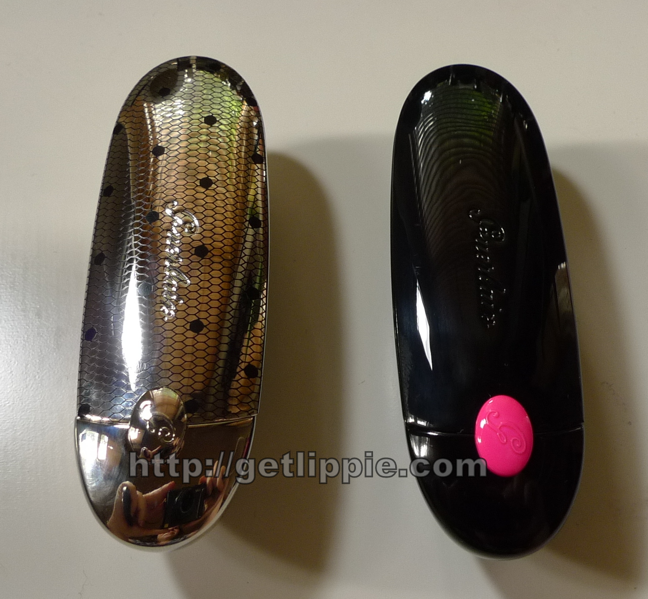
After featuring both the Guerlain Autumn and Winter collections recently, I got a few emails regarding the pink Rouge Gs from each, Madam Batifole and Provocative, so I thought comparing the two was a good idea:
Madame Batifole (left) is from the limited edition Madame Violette autumn collection currently on counters, and has a fishnet effect etched onto the casing. Provocative is from the Crazy Paris Christmas collection which will be on counter from November. Both are rather cool bright pinks, but there are differences:
Madame Batifole is the darker of the two, and Provocative is lighter. Contextually, Provocative appears the "warmer" shade, but is still quite a cool shade of pink.
Here are some more comparison shots:
 |
| Natural daylight |
 |
| With Flash |
Both are creamy shades, but as you can just make out in the flash picture above, Madame Batifole has a slightly more visible blue micro-shimmer in the formula. Provocative contains it too, but it's less visible in the bullet. On the skin, however, the shimmer is barely visible, it basically just adds a little depth to the shades and stops them appearing "flat".
 |
| Natural Daylight |
 |
| With Flash |
They're both highly pigmented, and creamy. Here you can see how Madame Batifole on the left is definitely a deeper shade, and Provocative is a little warmer in comparison, almost a bubblegum pink, whereas Batifole appears more magenta in comparison.
Here they are on my (quite strongly pigmented) lips:
I'd say that Madame Batifole is definitely the more dramatic shade to wear, being a little darker and deeper, Provocative is a perfect everyday pink shade, one I'd consider a neutral, but my tolerance to bright shades is quite high, and your mileage might, as they say, vary.
I tried wearing one lip of each to show how the differences aren't, actually, that dramatic. This is provocative on the top, and Madam Batifole on the bottom. Equally bright, equally pigmented, just one is a little warmer, and one a little cooler in comparison.
Personally, if I could only have one, I'd have Madam Batifole, as I'm a lover of the dramatic lip colours, but Provocative is a great everyday pink too. They're both gorgeous, frankly.
The Fine Print: One's a PR sample, and one was a purchase. It genuinely doesn't matter which one is which.
Mental note: I shall never wear the foundation featured in this post ever again, it looks terrible. I know.
This post: Guerlain Rouge G Comparison: Madame Batifole vs Provovative originated at: Get Lippie All rights reserved. If you are not reading this post at Get Lippie, then this content has been stolen by a scraper
Not much to say today, aside from the fact that I'm boggling a bit that I've been married for six months now ...
Mental.
This post: 6 Months ... originated at: Get Lippie All rights reserved. If you are not reading this post at Get Lippie, then this content has been stolen by a scraper
I have literally spent months trying to track this bloody thing down. Every SpaceNK I visit, I stare forlornly at the hole where Mood (and Diffused) are supposed to be, and then turn, dejected, back out to the street after yet another fruitless shopping trip. FINALLY I managed to track this one down on Liberty. I'm still on the lookout for Diffused, btw, so if you find anywhere that has it, please, please, please let me know!
This one, however, is Mood, a light lavender powder designed to brighten most skintones. I'm prone to (admittedly very pale) sallowness, particularly when extremely tired, and this helps perk me back up.
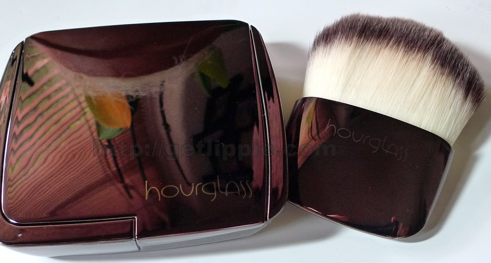
The Ambient Light powders are milled incredibly finely, and don't contain any opaque pigments so they're rather light and ethereal on the skin. I find they they do give a "polished" look to the skin, and they have a rather glowy finish, so you need to apply sparingly.
Here you can see it swatched heavily on the right, and blended out on the left of my hand, and you can see the sort of finish you will get. I use this most days, in particular over tinted moisturiser. I like the brush too (although you have to buy it separately and it's £30), and it's great for diffusing the powder across the skin.
I prefer this to more traditional powders, as it never looks cakey, and doesn't look like you're wearing any makeup at all, which is the greatest thing you can get from your makeup.
Now, if only I could find the yellow Diffused version ....
The Fine Print: Purchases.
This post: Hourglass Ambient Lighting Powder in Mood originated at: Get Lippie All rights reserved. If you are not reading this post at Get Lippie, then this content has been stolen by a scraper
Well, I said I needed to try some cheaper makeup ... and here I am! Again, like Illamasqua, Sleek MakeUP isn't a brand I feature often, as a lot of the collections don't "speak" to me. This one, however, very much did. I don't get the packaging much, it says "Autumn" rather than "Romance" to me, but the contents are delightful:
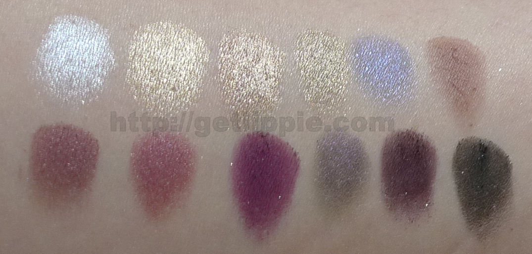
The eyeshadow shades are named after honeymoon destinations, l-r on the top row we have
Pretty in Paris - silver (metallic)
Meet in Madrid - gold (metallic)
Court in Cannes - taupe (shimmer)
Lust in LA - olive (shimmer)
Romance in Rome - blackened navy (shimmer)
Propose in Prague - terracotta (matte)
And on the bottom row (l-r) we have
A Vow in Venice - maroon (shimmer)
Marry in Monte Carlo - fucshia (metallic)
Honeymoon in Hollywood - purple (shimmer)
Bliss in Barcelona - blackened purple (shimmer)
Forever in Florence - matte purple (glitter)
Love in London - matte black (glitter)
I found the shadows to be deeply pigmented, even without primer, but the pans are a little prone to kicking up dust, and they're slightly "glazed" after just a couple of uses, but for the price (£7.99) these are extremely minor quibbles.
I found the two darkest non-glitter shades were the hardest to swatch, both Romance in Rome (blackened navy, and Bliss in Barcelona (blackened purple) have a slight duochrome effect, but neither are as pigmented as any of the other shades, which is a shame, but this still leave ten really rich, pigmented and pretty colours to play with.
I created this look with the palette:
I used Court in Cannes all over the mobile lid up to the crease, and Lust in LA to line the lower rim. Then I defined the crease and outer corner with A Vow in Venice, and then patted a little Marry in Monte Carlo onto the lid to brighten. Then I liked the upper lid with Love in London. The look lasted all day over primer, and I was really pleased with it.
Antique is a bronzed-rose with a large amount of silvery-blue shimmer in the formula. It's pretty, but a little too glittery for me for everyday wear. Be a great shade for evening wear though. I'm an idiot and forgot to swatch this separately. For £4.99 though, this is a great bargain, it's very reminiscent of Sin by NARS. I'll try and swatch them side-by-side next week.
The Sleek MakeUP Vintage Romance palette and Antique blush will be available from September. You'll be able to find it at Superdrug.
The Fine Print: PR Samples.
This post: Sleek MakeUP Vintage Romance Palette & Antique Blush originated at: Get Lippie All rights reserved. If you are not reading this post at Get Lippie, then this content has been stolen by a scraper
The sharp-eyed amongst you will have noticed that I've featured two very similar lipstick shades this week, Illamasqua Shard and Lancome's Rose Sulfureuse, both shades of plum, they're both deep and pigmented and cool, I like them both very much. Typical though, you go and buy a lovely plum lipstick, then attend the launch of yet another beautiful plum lipstick literally minutes later - lipsticks are like buses, sometimes ...
Anyhoo, I thought it might be good to compare the two:
Illamasqua Shard is 4.2g for £16.50, and Lancome Rose Sulfureuse is 4.0g for £21.50.
In the bullet, Shard appears bluer, and deeper, whereas Rose Sulfureuse appears pinker, both look matte in the bullet, which is surprising.
On swatching, the differences are more pronounced. Shard is definitely far deeper and cooler, whilst Rose Sulfureuse is pinker, sheerer and far, far, far more glossy.
I applied a sheerer layer of Shard to my lips, than I did Rose, and the differences aren't quite as marked as a result, Shard is redder (but still cool) and rose is cooler, and still pinker. Shard will last a LOT longer than Rose, however, but Rose will be far kinder to your lips ...
Fancy one?
The Fine Print: Mixture of PR samples and purchases.
This post: Illamasqua Shard vs Lancome Rose Sulfureuse originated at: Get Lippie All rights reserved. If you are not reading this post at Get Lippie, then this content has been stolen by a scraper